Wednesday 7 December 2011

Displaying my outcomes - contextual knowledge


After my assessment group crit on Friday i realised how poor i had used my space. the displaying of context was all wrong and i feel that from this crit i have now made alterations.

Here is what it was like for the crit:


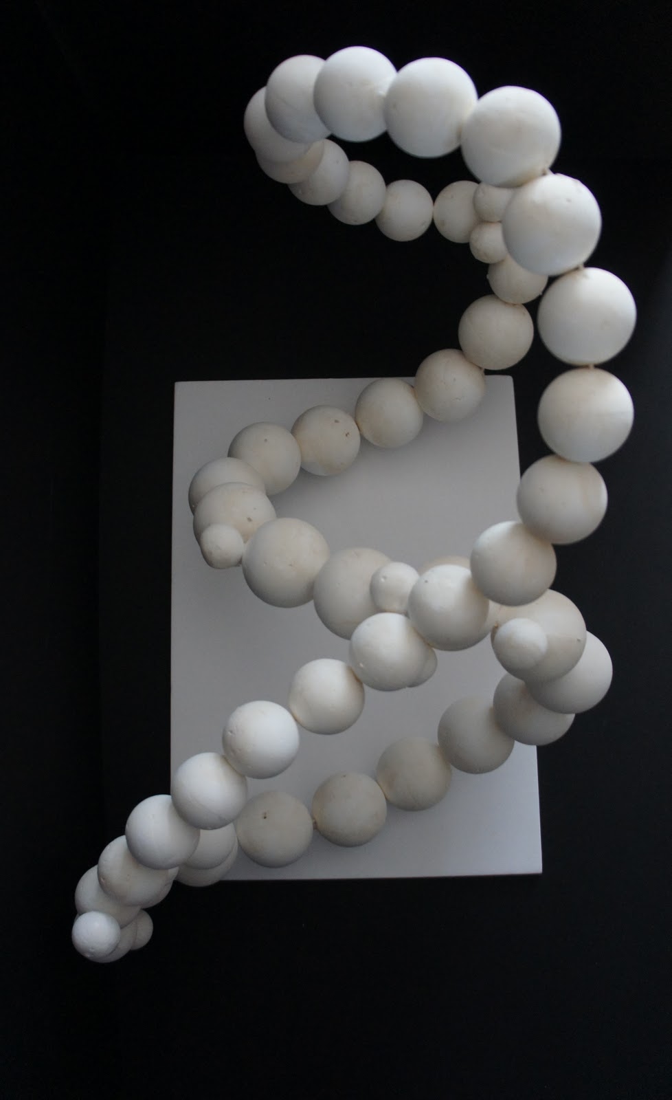
I have made a handbag to go with my shoe (not pictured above) and Instead now i am using the smaller plinth and the tall plinth together for my shoes and handbag. like it looks like a shop window. I'm using a small coffee table for my newspaper selection. Ive made another slimmer plinth for the 57 white object and i am putting the ship and map inside/ on top of a vintage old suitcase.

___________________________________________________________
Here is how it looks now ready for assessment after the crit.


Context Title

After much deliberation i have decided to change my project title for the context project. It was originally "make a work which moves from one place to another' and i think that the "make work that is collaborative and socially engaged" is more appropriate because the postcards were made by others and they are a collection of peoples work and they are collaborated in Way that demonstrates them as a whole outcome.


I think that all the postcards have worked really well and they are all very unique which is the outcome i was looking for. The outcome fits the title appropriately because it is socially engaging and is a collection of art. Initially i had major problems at the start of this project and because i was so concerned with the other 3 projects i felt that this was the weakest one. At first i chose a different title - the text based one however it was hard to get a starting point. after doing some contextual research and thought i decided to send different people and ask people if they could do me a postcard and post it to me. To encourage people to do it i put a stamp on them and wrote my address on them.

the biggest challenge was getting everyone to cooperate and send them in on time.

If i were to do the project again i would have made sure i had more time - i would have created and photo/ look book with photographs of the postcards instead of putting them in an album.

Wednesday 30 November 2011

Context Project

After much thought i have decided to do the "Make a piece of art that moves from one place to another" because my other ideas were not working, they wasnt strong enough and i struggled having a starting point. Hopefully this new project idea will be more appropriate and successful.

so i am making plain postcards and sending them pre addressed and stamped and asking them to do anything they like on the post card, be that a thought, qoute, diary entry, picture, photo or college etc and then send it back to me through the post.

the final outcome will be a series of postcards pinned to the wall in a long line or group.

TBC

Textiles Workshop

The aim of the textile workshop was to use the sewing machines, embossing machine and the over lockers to create a sculptural piece that was either something to wear as a piece of clothing or jewellery.

we could only use scraps of material provided and use the mannequins if we wanted to.

In my piece i used the over locker, the sewing machine and hand sewing. I didn't add anything onto my piece that was made with the embosser however i did have a go and thought it would work well with another project outcome.


Monday 28 November 2011

Display - my Outcome

The purpose of my outcome is a scuptural peice that is made from a book of Maps - As the title requires for something to be made that opens out, spreads out or unfolds. I started experimenting with paper engineering and pop up.

problems and challenges that i encountered were the flag poles, the flags would not hold up if they were made from paper so i had to improvise and use carved down cocktail sticks for support. I think i could have made the ship bigger however this probably would have took the novelty of the gentile-ness of it. and it would be too much like my Image project. I think that the outcome is appropriate to the brief becuase the maps demonstrate the openess of the project and the pop up diplays the unfold part.

My ship is for show and it doesnt actually pop up. however if i had more time and if i did more research i would actually cut it so it does.

I think when i am displaying it i will use a plynth and make it focus point.


Image - my Outcome

I have two outcomes for this project title. I really wanted to do a newspaper and a magazine.

With the newspaper i created a camera, pen and notepad from a single magazine. (see previous blog posts for images)

I then turned my attention to the magazine version. I decided to make a shoe from a single magazine. Once i had made the heeled shoe i wanted to take it much further, i decided to put the shoe back into the magazine - in terms of a shoe advert. The shoe is made from the magazine - reanimating it and therefore reusing it in a different way. so i decided to make the advert proposing reusing shoes and recycling them.

I took a picture of my shoe and then printed them and created a collage style effect. along with 'ransome' note style text and parcel paper.

The outcome is functional - it has a purpose to encourage people to recycle their shoes. Problems i encountered in the making of the shoe was making sure it was to size and to a relevant scale. the shoe is based on a size 6 and i used another real shoe as guidance. I was influenced by paper art and using recycled materials.

I think that the shoe could have been made more precisely and i feel that i should have gathered all the relevant colours together instead of making it up of all different colours.
I also think that the sole of the shoe could have been cut better as it does look rough.


After another group crit i scrapped the magazine advert idea and made a handbag and displayed them toegther instead of the magazine. the shoe and handbag look much better now together as a collection rarther than the advert idea because it didnt really demonstrate the title well enough and it was unclear to view.


Object my Outcome.

After id given it some more thought and decided to use polystyrene balls instead of paper i started experimenting with smaller polystyrene balls. I was inspired from when i went scuba diving back in august - looking through the photos again, i really liked the idea of creating a coral type piece.

"Create a white 3D object with 57 sides' - there are 3 different challenges in the title, it had to white, it had to be 3D and it had to have 57 sides - the amount of sides were the most challenging until i realised that i could use sphere shapes as they have 1 side each!  

The aim of this piece is a artistic sculpture - it is for display only and it isn't functional.

 I had issues with the polystyrene having a few holes in so i brought some white filler and that worked well because it of the colour and the way it can have a smooth top.

The size was going to be much bigger approximately 6ft, with giant shapes. however transporting this would be incredibly difficult. The 2cm Polystyrene balls used for the testing were too small. So i had to use fist size balls instead. However initially i was going to use white balloons - but these would deflate before assessment.

Here is my tester:


Here is my outcome:


Wednesday 23 November 2011

Metal Workshop - Jewellery


The objective of the metal workshop was to experiment with different materials, techniques and processes in case of including them and using them in our field guide projects.

We were shown some techniques and we talked about materials and health & safety.

We had one day until 4pm to created as many pieces as we could using different equipment and materials. I made two rings and a pendant.


The first item i made was the ring with the discs on. its made from copper and aluminum. fixed together with a tiny rivet.

The second item is a Wave piece of copper wire and then put through the rolling press

And the third is made from embossing lace onto the aluminum through the rolling press and then shaped on the ring shape.

I used the following tools:

Polisher
hammers
mallets
files
pliers and files
borax
centre punch
rivet gun
tweezers 
gas & oxygen supply

I really enjoyed the metal workshop and learnt a great deal! however it doesn't really fit into any of my project titles. not to say that i wont use the techniques and skills in the future!

Thursday 17 November 2011

Wood Work Shop - Replication

On Tuesday I took part in a Wood workshop. In the workshop the task was in pairs or three's create a 6:1 model of one of the machines in the 3D workshop. I was working with Zoe Hodges and Kelly Robinson. We decided to do one of two bandsaws.

Using the knowledge of health and safety learnt in the induction week we all worked together to take every measurement possible of the bandsaw. and drew up a design with the measurements then one with the scaled drawing.


Then we deligated different parts between ourselves - we all had a go at doing everything. My favorite bit was making the round edges of the pieces and cutting out the indent peice on the main body of the model because it was something new and i will definatly use this skill again.

here are some photos of our 6:1 model of a band saw.


Monday 14 November 2011

Display - Finished outcome

So after my formative crit assessment last thursday i have been working on my idea after the feedback from fellow students.

My ship before was made in a 2D form with a mount board as a stand. Now i have made it so that the whole thing is 3D and it is made from a pop up - cutting the pieces to make it in as few pieces as possible. I did have to use thinned cocktail sticks as i experimented with other techniques and these failed. Materials like the map paper, map paper round a cocktail stick etc.

Here is my freshly made pop up ship.


I think this ship is a lot more successful than the last one as it had more depth and it is more visually exciting. the skill level is higher than its previous.

i was influenced by Peter Callesen

Wednesday 9 November 2011

Final Outcome - Image

My project title for this project - "Appropriate rearrange and reanimate all the images from a single magazine or newspaper"

after much deliberation, thought and artist research i decided to design and make something from a single newspaper. at first i wanted to make a pair of shoes or handbag from a fashion magazine - but i had already done this in a previous stage. So i decided to move onto a newspaper. I jotted down things that relate to newspapers - a paparazzi camera, note pad and pen.

Even though my outcome is made of the text - i feel that a whole newspaper is an image - stories and articles that portray an image of society and current affairs.
I feel i have rearranged and i have reanimated a single newspaper in an appropriate manner.


Final Outcome - Object

Here is my final outcome for 'Create a white 3D object with 57 sides'.

I decided originally to do balloons however i wanted it to last longer than a few days. so when i was out shopping i saw some polystyrene white balls. I brought 57 in 3 different sizes and experimented with the construction and shape until i was happy. Overall i am pleased and i think it meets the brief and is appropriate. I was inspired by sea shells and coral reef plants.


Sunday 6 November 2011

Context project - Make some text based work that uses the most appropriate typeface.

From the Field guide book:
"This Document is typeset Gill Sans, named after Eric Gill. Make some text based work that uses the most appropriate typeface."

This really appealed to me as i really enjoyed the typography unit in my previous course. I Started looking at Sans Serif and Serif Typefaces and to see how they differ as a starting point.

Here is an example of Serif type:


Seen here in Red:


Here is a Sans Serif type:


Then researching Helvetica and Arial in more depth i found that arial is Microsofts version of Helvetica. They are incredibly simular and almost identical but when you overlap them it is quite clearly obvious!

Helvetica is in Pink and Arial is in Blue:


Helvetica = Sans Serif Typeface
Times New Roman = Serif Typeface

Sans Serif typefaces are used for motorway & road signs and news headlines because they can be read at a glance and at a distance

Serif Typefaces are used in articles, books and magazines to help guide the eye along the lines in large blocks of text.  

_______________________________________________


Another typeface i found really interesting that Comic Sans is most appropriate to use in schools as the 'a' is designed to be seen how a child would right an 'a' not like any other font.

 
apposed to
 a

This typeface is most helpful for Dyslexics as well.  

________________________________________________

The idea is to make a piece of work that is simple yet gets people thinking.